MICROWAVE

Nutri
Buddy

A microwave redesign human computer interaction project

TYPE: GROUP PROJECT

TYPE: GROUP PROJECT

TIMELINE: 3 MONTHS

TIMELINE: 3 MONTHS

FOCUS: UI / UX + HCI

FOCUS: UI / UX + HCI

TOOLS: FIGMA, CHATGPT

TOOLS: FIGMA, CHATGPT

DESIGN PROCESS

DESIGN PROCESS

DESIGN PROCESS

From research to a better microwave.

A simple process kept the project focused.

01 DISCOVER

01 DISCOVER

Research
Research

Understand users, context & challenges.

Understand users, context & challenges.

02 DEFINE

02 DEFINE

Frame
Frame

Create personas & problem statement.

Create personas & problem statement.

03 STRUCTURE

03 STRUCTURE

Plan
Plan

Build user flow & information architecture.

Build user flow & information architecture.

04 PROTOTYPE

04 PROTOTYPE

Make
Make

Explore physical and digital concepts.

Explore physical and digital concepts.

04 VALIDATE

04 VALIDATE

Iterate
Iterate

Test with users & refine the design.

Test with users & refine the design.

01 DISCOVER

01 DISCOVER

01 DISCOVER

Understanding the Project.

Start with the problem, people and existing behaviour.

THE BRIEF

Make microwave controls clearer, simpler and easier for everyone to use.

STAKEHOLDERS

Student

Working professionals

Elderly

Domestic Helpers

SECONDARY RESEARCH

PRIMARY RESEARCH

Survey
Survey

50 + responses on usage,
challenges & preferences.

50 + responses on usage,
challenges & preferences.

Interview & Observations

4 users from different contexts.

4 users from different contexts.

RESEARCH INSIGHTS

RESEARCH INSIGHTS

RESEARCH INSIGHTS

Research before redesign.

The main patterns were simple and consistent.

Use of microwave
Use of microwave

65 Responses

65 Responses

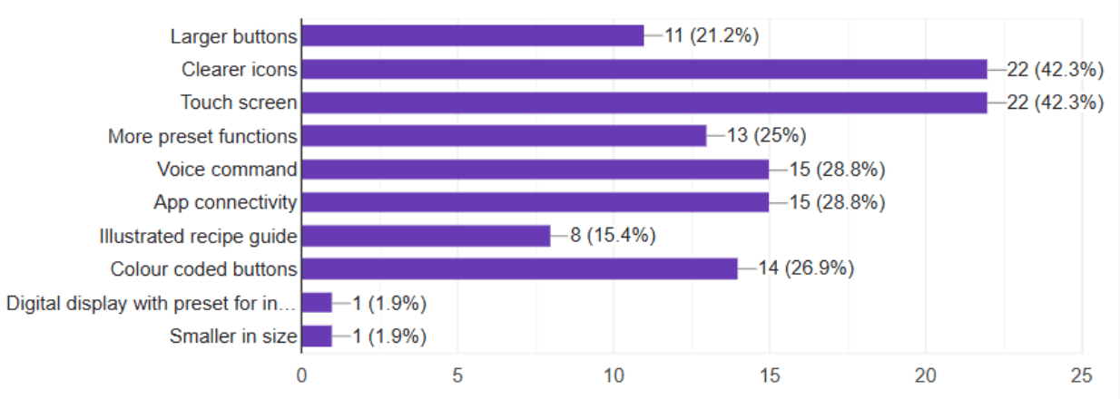
Make your microwave experience better

65 Responses

65 Responses

Use of Microwave
Use of Microwave

65 Responses

65 Responses

Target Users
Target Users

65 Responses

65 Responses

Typically used a microwave for?

65 Responses

65 Responses

Gender
Gender

65 Responses

65 Responses

Presets are rarely used: confusing or irrelevant.

Presets are rarely used: confusing or irrelevant.

Microwave design doesn't align with Indian food habits.

Microwave design doesn't align with Indian food habits.

Worn-out labels and unclear icons lead to mistakes.

Worn-out labels and unclear icons lead to mistakes.

25

25

HOME USERS

HOME USERS

Advanced features remain underused or misunderstood.

Advanced features remain underused or misunderstood.

2

2

OFFICE PROFESSIONAL

OFFICE PROFESSIONAL

Most users rely on basic functions (Start, Stop, Reheat)

Most users rely on basic functions (Start, Stop, Reheat)

4

4

ELDER USERS

ELDER USERS

Struggle with small fonts and cluttered controls.

Struggle with small fonts and cluttered controls.

WHAT I CHECKED
WHAT I CHECKED

Can users see the main action? Is important information grouped together? Can the screen be understood without reading everything?

Can users see the main action? Is important information grouped together? Can the screen be understood without reading everything?

02 DEFINE

02 DEFINE

Turn research into a user.

Personas make the problem easier to design for.

AARUSHI

AARUSHI

AARUSHI

College Student
College Student
College Student

Uses microwave in hostel for quick, hassle free meals.

Uses microwave in hostel for quick, hassle free meals.

Uses microwave in hostel for quick, hassle free meals.

Wants: fast and easy cooking

Struggles: confused buttons & unclear labels

Wants: fast and easy cooking

Struggles: confused buttons & unclear labels

Wants: fast and easy cooking

Struggles: confused buttons & unclear labels

LATA

LATA

LATA

Domestic Helper
Domestic Helper
Domestic Helper

Uses microwave occasionally in households.

Uses microwave occasionally in households.

Uses microwave occasionally in households.

Wants: simple controls in local languages.

Struggles: English only labels & fear of pressing wrong buttons.

Wants: simple controls in local languages.

Struggles: English only labels & fear of pressing wrong buttons.

Wants: simple controls in local languages.

Struggles: English only labels & fear of pressing wrong buttons.

ROHAN

ROHAN

ROHAN

Office Professional
Office Professional
Office Professional

Uses microwave in office microwave to reheat meals.

Uses microwave in office microwave to reheat meals.

Uses microwave in office microwave to reheat meals.

Wants: quick and reliable use

Struggles: multiple functions are overwhelming.

Wants: quick and reliable use

Struggles: multiple functions are overwhelming.

Wants: quick and reliable use

Struggles: multiple functions are overwhelming.

MR. DESHPANDE

MR. DESHPANDE

MR. DESHPANDE

Senior Citizen
Senior Citizen
Senior Citizen

Uses microwave for reheating and simple cooking.

Uses microwave for reheating and simple cooking.

Uses microwave for reheating and simple cooking.

Wants: clear display and large buttons.

Struggles: small fonts and difficult to read screens.

Wants: clear display and large buttons.

Struggles: small fonts and difficult to read screens.

Wants: clear display and large buttons.

Struggles: small fonts and difficult to read screens.

EMPATHY MAP

EMPATHY MAP

EMPATHY MAP

What users say, think, feel and do.

Helped connect research findings to real emotions and behaviours.

SAYS
SAYS

"I just press Start and Stop."
"I'm not sure what the other buttons do."

"I just press Start and Stop."
"I'm not sure what the other buttons do."

THINKS
THINKS

"Will this setting work for my food?"
"What if I press the wrong button?"

"Will this setting work for my food?"
"What if I press the wrong button?"

FEELS
FEELS

Confused, hesitant and a little anxious while using the microwave.

Confused, hesitant and a little anxious while using the microwave.

DOES
DOES

Uses only familiar functions,
tries to guess and sometimes asks for help.

Uses only familiar functions,
tries to guess and sometimes asks for help.

AS IS JOURNEY

AS IS JOURNEY

AS IS JOURNEY

Find the gap in today's routine.

The problem happens when parents need a quick answer but don't have one.

Decide

User decides to reheat or cook food.

Figure out settings

Looks for the right button or time.

Uncertainty

Confused by multiple options and labels.

Seek help

Sometimes asks someone for guidance.

Use with caution

Uses basic functions and avoids exploring.

HOW MIGHT WE?
HOW MIGHT WE?

How might we make microwave controls simpler and more intuitive for everyone to use?

How might we make microwave controls simpler and more intuitive for everyone to use?

03 DEVELOP

03 DEVELOP

Explore before choosing.

Different interface formats were considered based on user needs and context of use.

Physical Buttons / Knobs

Tactile and familiar, but often cluttered and confusing.

Tactile and familiar, but often cluttered and confusing.

Digital Touchscreen
Digital Touchscreen

Looks modern and clean, but harder for some users to navigate.

Looks modern and clean, but harder for some users to navigate.

Mobile Apps
Mobile Apps

Useful for smart features and recipes, but not always accessible.

Useful for smart features and recipes, but not always accessible.

User Manual / Guide
User Manual / Guide

Provides detailed information, but rarely read or kept for future use.

Provides detailed information, but rarely read or kept for future use.

CHOSEN DIRECTION
CHOSEN DIRECTION

A combined physical + digital interface with simple, clear controls supported by on-screen guidance.

A combined physical + digital interface with simple, clear controls supported by on-screen guidance.

TO BE JOURNEY

TO BE JOURNEY

Design a simple cooking experience.

A smooth and intuitive flow from selecting to cooking.

Choose Function

Select reheat, defrost or cook.

Select food

Pick a preset or set time manually.

Check settings

Review time, power and quantity.

Start cooking

Press start and let it cook.

Get notified

Clear audio/visual alert when done.

TASK FLOW

TASK FLOW

To perform any task.

The main flow stays short so parents can finish it without unnecessary steps.

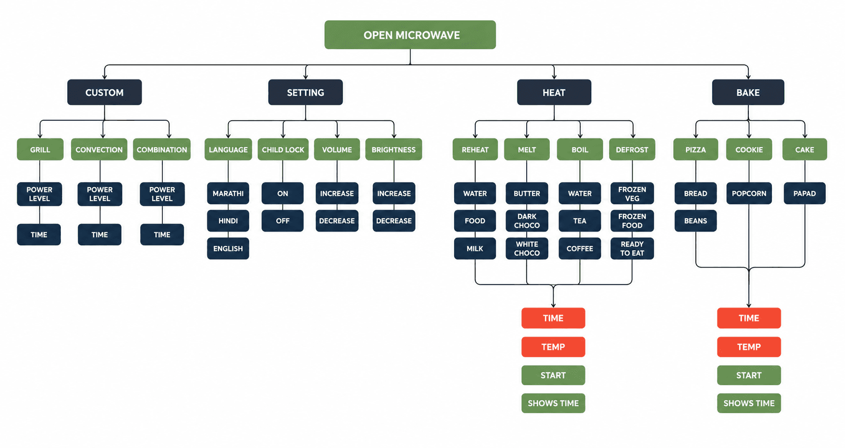
INFORMATION ARCHITECTURE

INFORMATION ARCHITECTURE

Organise around real tasks.

Four main areas keep the app easy to navigate.

04 DELIVER

04 DELIVER

Ideating through storyboarding

Visualising how a user completes a key task on the microwave.

Big Picture Storytelling

Close Picture Storyboarding

WHAT I CHECKED
WHAT I CHECKED

Can users see the main action? Is important information grouped together? Can the screen be understood quickly?

Can users see the main action? Is important information grouped together? Can the screen be understood quickly?

STYLE GUIDE

STYLE GUIDE

STYLE GUIDE

Make the interface feel calm.

Visual choices support the same goal: less confusion and easier use.

Visual Direction
Visual Direction

Clean, minimal and familiar. Inspired by everyday appliances.

Clean, minimal and familiar. Inspired by everyday appliances.

Colours
Colours
TYPOGRAPHY AND LAYOUT

Why:

Why:

SPACING AND CARDS
SPACING AND CARDS
Visual Direction

Clean, minimal and familiar. Inspired by everyday appliances.

TYPOGRAPHY AND LAYOUT

Why:

Colours
SPACING AND CARDS

LOW FIDELITY USER INTERFACE

LOW FIDELITY USER INTERFACE

LOW FIDELITY USER INTERFACE

Physical Wireframes.

These screens represent the core functions for a simple and intuitive experience

LOW FIDELITY USER INTERFACE

LOW FIDELITY USER INTERFACE

LOW FIDELITY USER INTERFACE

Prototypes.

These models show how the physical interface and screen work together.

USABILITY TESTING

USABILITY TESTING

USABILITY TESTING

Test, listen, improve.

We tested the interface with different users.

TEST GOALS
TEST GOALS
  • Can users complete a basic task?

  • Are the labels and icons clear?

  • Do the controls and screen make sense?

  • Where do users get confused?

FEEDBACK 01

FEEDBACK 01

Some labels were unclear.

Use simpler, more familiar words and icons.

FEEDBACK 02

FEEDBACK 02

Button layout felt crowded.

Increase spacing and group related functions.

HIGH FIDELITY USER INTERFACE

HIGH FIDELITY USER INTERFACE

HIGH FIDELITY USER INTERFACE

Digital Wireframes.

These screens represent the core functions described in the project

HIGH FIDELITY USER INTERFACE

HIGH FIDELITY USER INTERFACE

HIGH FIDELITY USER INTERFACE

Turn the structure into screens.

These screens show the designed interface with visual style, icons and content.

Heat option with reheat, defrost, melt, boil process options.

Custom option with grill, combination and convection options.

Bake button with different food menu options to bake.

Settings with brightness, language, child lock and volume control options.

HIGH FIDELITY USER INTERFACE

HIGH FIDELITY USER INTERFACE

HIGH FIDELITY USER INTERFACE

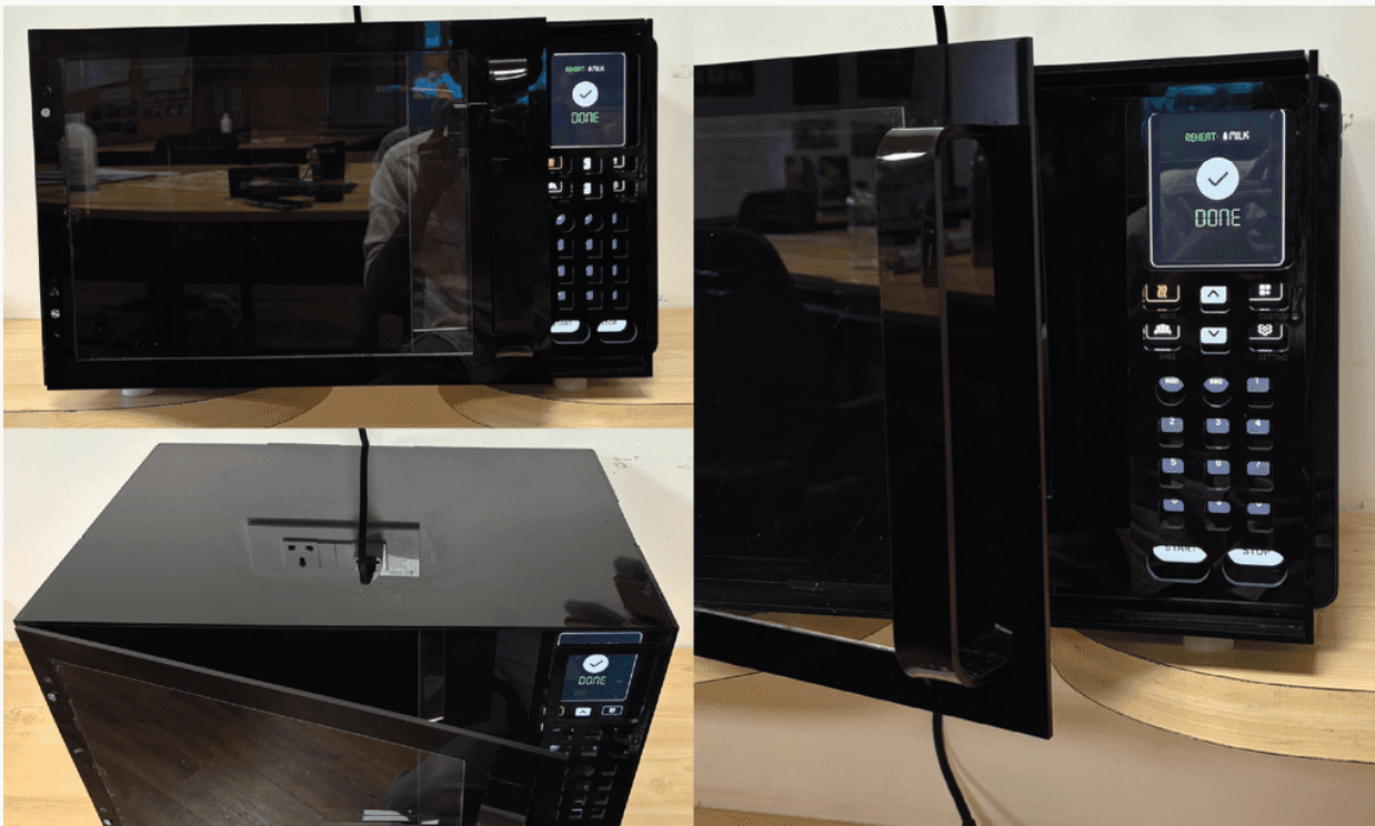
Physcial Model

A working model to test the size, placement and interaction of the interface.

HIGH FIDELITY USER INTERFACE

HIGH FIDELITY USER INTERFACE

HIGH FIDELITY USER INTERFACE

Digital Renders

These renders show the final design with a clean and modern look.

POST FEEDBACK

POST FEEDBACK

POST FEEDBACK

Design changes after testing.

Testing is only useful when feedback changes the design.

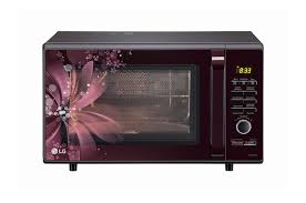
BEFORE

BEFORE

Cluttered and outdated.

Busy visuals and unclear labels made it hard to use.

AFTER

AFTER

Cleaner and more intuitive.

Simpler layout, clear icons and better hierarchy.
TAKEAWAY

TAKEAWAY

TAKEAWAY

Less guesswork. More confidence.

The redesigned microwave makes everyday cooking simpler and more approachable. By combining a clean physical interface with clear on-screen guidance, it helps users cook, reheat and explore with confidence.

Mitali Yeole

UI UX Designer

UX Researcher

UI Designer

Mitali Yeole

UI UX Designer

UX Researcher

UI Designer

Mitali Yeole

UI UX Designer

UX Researcher

UI Designer