
Kedesigning the ike le weosite to make train travel planning simpler, faster and more user-friendly for all kinds of travellers.
From problem to product.
Understanding the Problem.
THE BRIEF
IRCTC is one of the most used travel platforms in India, but the current website teels outdated, cluttered and confusing for many users. Our goal was to make the experience simpler, more intuitive and accessible for all.
Train ticket booking and tour package booking journeys were selected to be redesigned.
SECONDARY RESEARCH

PRIMARY RESEARCH


Where users get stuck.

Journey 1: Train Ticket Booking
FEATURES
IRCTC
MAKEMYTRIP
IXIGO

Data-rich, cluttered

Well-structured cards

Visual cards, color-coded
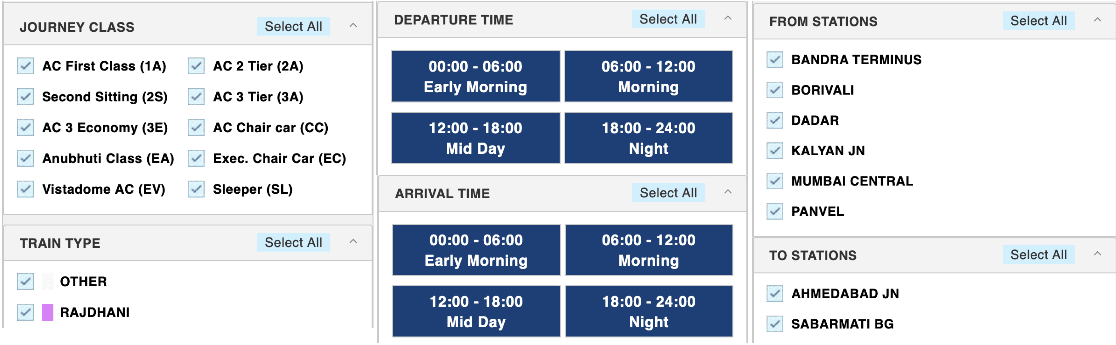
Basic, limited options

Modern toggles

Simple, interactive
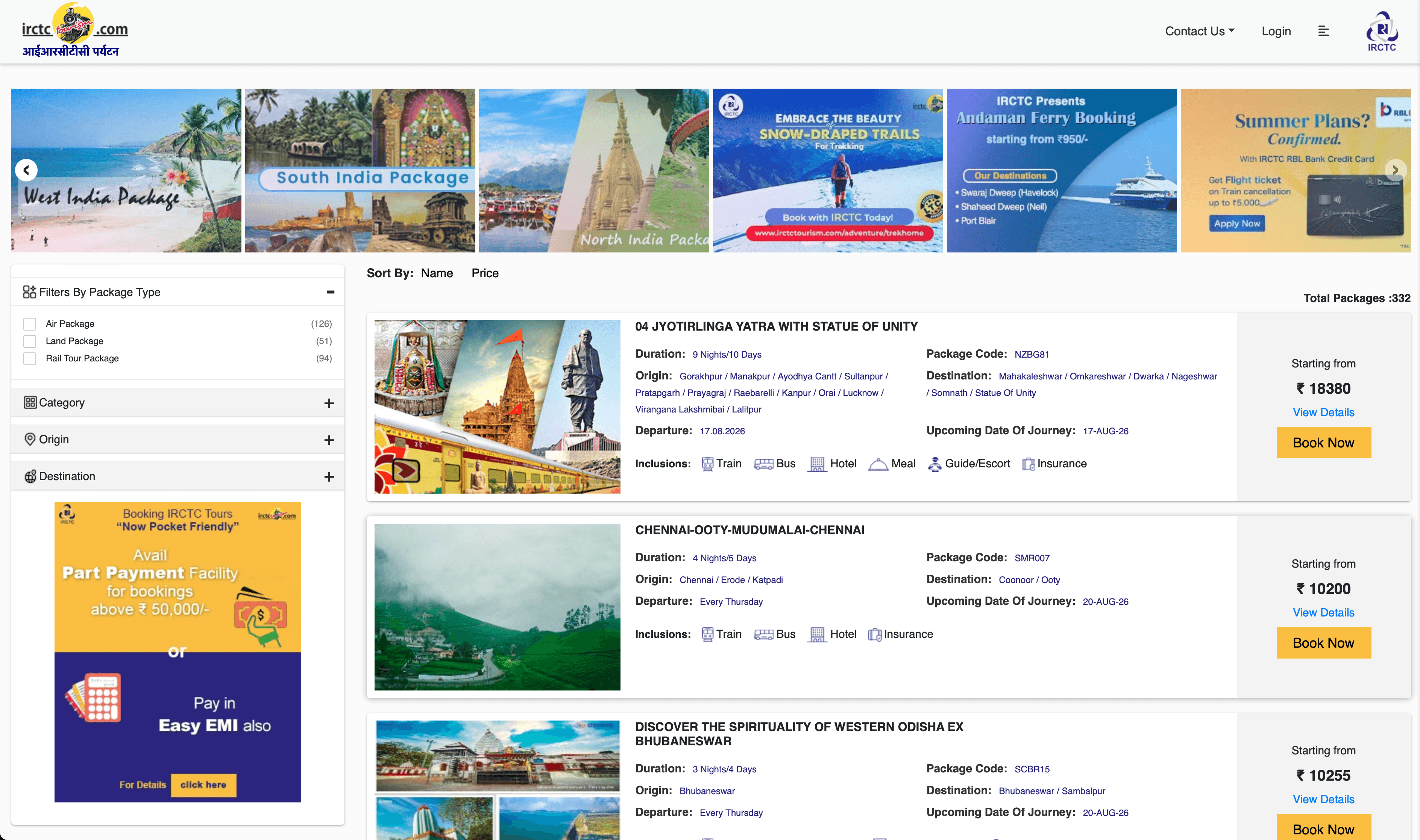
Journey 2: Tour Package Booking
FEATURES
IRCTC
MAKEMYTRIP
KESARI

Scroll to see options

Quick view with categories

Compare 3 at once

Basic & scattered filters

Detailed filters by vibe
Easy sliders for price & days
Personas & Empathy Maps According to Journeys
Journey 1

ADITI, 33
Marketing Consultant · Bengaluru
Needs fast last-minute booking without repeating details.
Wants notifications, live train tracking and coach position.
Frustrated by login, payment failure and weak tracking.
Journey 2

AVINASH, 42
Teacher · Delhi
Needs visible inclusions, photos, reviews and flexible options.
Wants enjoyable, affordable family trips.
Feels anxious when prices, inclusions or payment outcomes are unclear.
Too much effort.
Journey 1
Journey 2
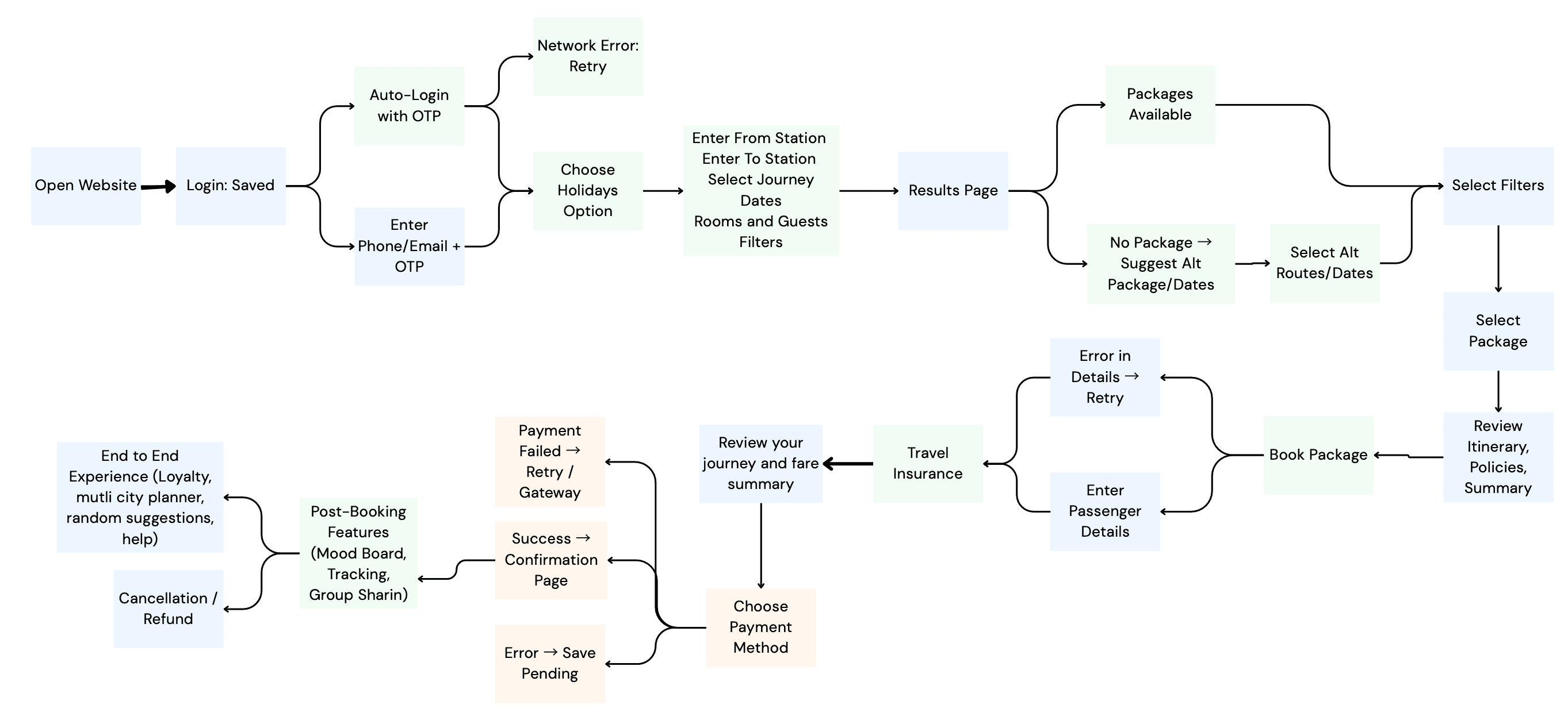
Turn friction into features.
Clearer from start to finish.
Journey 1
Journey 2
Organise the platform by role.

One key task: log a meal.
Journey 1

Journey 2
Making wireframes.

Turn the structure into screens.

Home Screen

Teacher Student progress checking dashboard

Student ai lead catch up

Parents can check homework

Message & Chat

Calendar and Event
Test, listen, improve.
Can users book tickets easily?
Is train information clear?
Is payment and confirmation simple?
Reduce clutter and make navigation easier.
Use clear buttons and step-by-step guidance.
Turn the structure into screens.
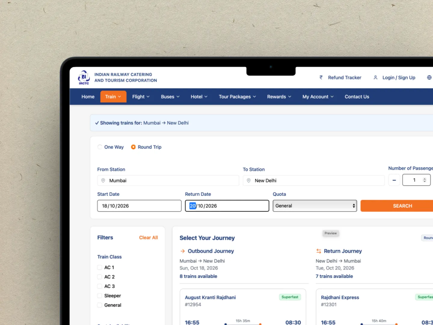
Round Trip Train Journey Booking
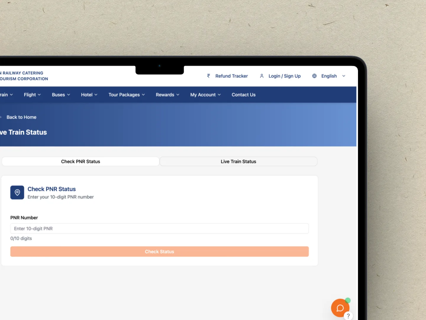
Live Status Tracking

Tour Package Details

Tour Package Options

Upcoming and Past Trips

Customise Packages
Design changes after testing.
Darker screens and less supporting detail made some information.

Darker screens and less supporting detail made some information.

Darker screens and less supporting detail made some information.

Darker screens and less supporting detail made some information.

Darker screens and less supporting detail made some information.
Darker screens and less supporting detail made some information.

Darker screens and less supporting detail made some information.

Darker screens and less supporting detail made some information.
