
A education platform that connects teachers, students and parents through clearer communication, learning support and AI-powered features.
From problem to product.
Understanding the Project.
THE BRIEF
AI Integrated school communication platform.
STAKEHOLDERS

Parents

Teachers

Students
SECONDARY RESEARCH

PRIMARY RESEARCH


Listen to all three sides.
TEACHERS
PARENTS
STUDENTS


Existing apps are fragmented.
Platform
3 User Roles
AI Powered
Study Planner
Parent Alerts
Fee Management


Turn research into a user.

TEACHER
The Overwhelmed Educator
Needs: less admin, easier communication and better visibility into students.
Feels: overloaded by repetitive tasks.

STUDENT
The Disengaged Learner
Needs: engaging learning, quick revision and a comfortable way to ask doubts.
Feels: unmotivated when learning is repetitive.

PARENT
The Anxious Guardian
Needs: clear updates and simple progress visibility.
Feels: uncertain when information is difficult to find.
What users say, think, feel and do.



Today’s experience is fragmented.
Explore ideas before building screens.


A simpler journey for every role.
One key task: log a meal.
Organise the platform by role.

Structure before styling.

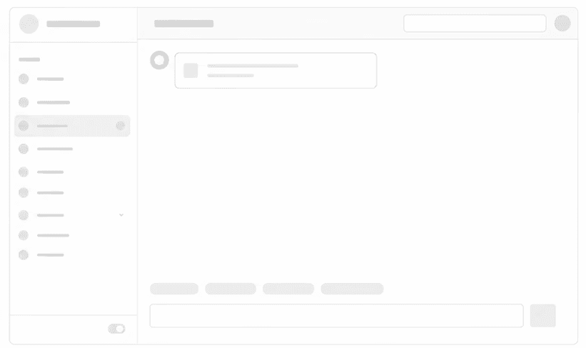

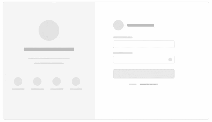
Turn the structure into a clear interface.


Turn the structure into screens.

Home Screen

Teacher Student progress checking dashboard

Student ai lead catch up

Parents can check homework

Message & Chat

Calendar and Event
Test, listen, improve.
Can users find updates easily?
Can teachers track student progress?
Is communication between parents, teachers and students clear?
The blue-cyan palette felt too much like a tech platform than a learning app.
Use clear actions and helpful prompts to guide users through learning and communication.
Turn the structure into a clear interface.


Design changes after testing.
Darker screens and less supporting detail made some information.
Use softer backgrounds, clearer cards and more context.


Turn the structure into screens.

Home Screen: Easy login from email id

Teacher Insight: Track student progress

Student Smart Learn: Play games & learn

Parent Exam & Results: See child progress

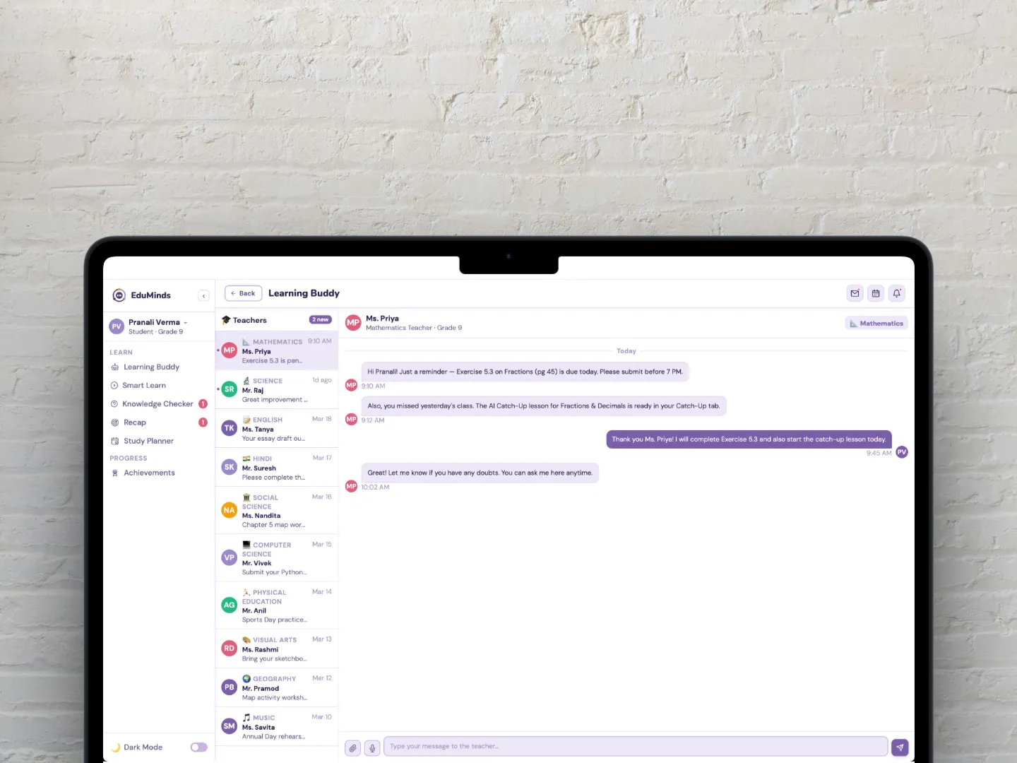
Chat & Message: with all personas

Calendar: sync with google calendar
Calendar: sync with google calendar

Calendar: sync with google calendar