
City-exploration app concept that helps people discover local places based on mood instead of repeatedly browsing the same popular options.
From problem to product.
What is CityKhoj ?
THE BRIEF
People may know that they want to go out, but not know where to go. The choice changes with the moment: sometimes they want a peaceful place, sometimes something fun, social or different.
DESIGN OPPORTUNITY
Instead of asking users to search by place or category first, CityKhoj starts with the experience they want. Mood becomes the shortcut between “I want to go somewhere” and “this place feels right.”
The idea behind CityKhoj.


Understanding the current landscape.
Features
Zomato
Swiggy
Book My Show
Google Maps
City Khoj
Food & Restaurant Discovery


Entertainment Discovery
Places & Navigation
Designing for a local explorer.


What users say, think, feel and do.


Find the gap in today's routine.
Explore before choosing.


Design a better daily loop.
One clear route

Organise around real tasks.

Structure before styling.

Turn the structure into screens.

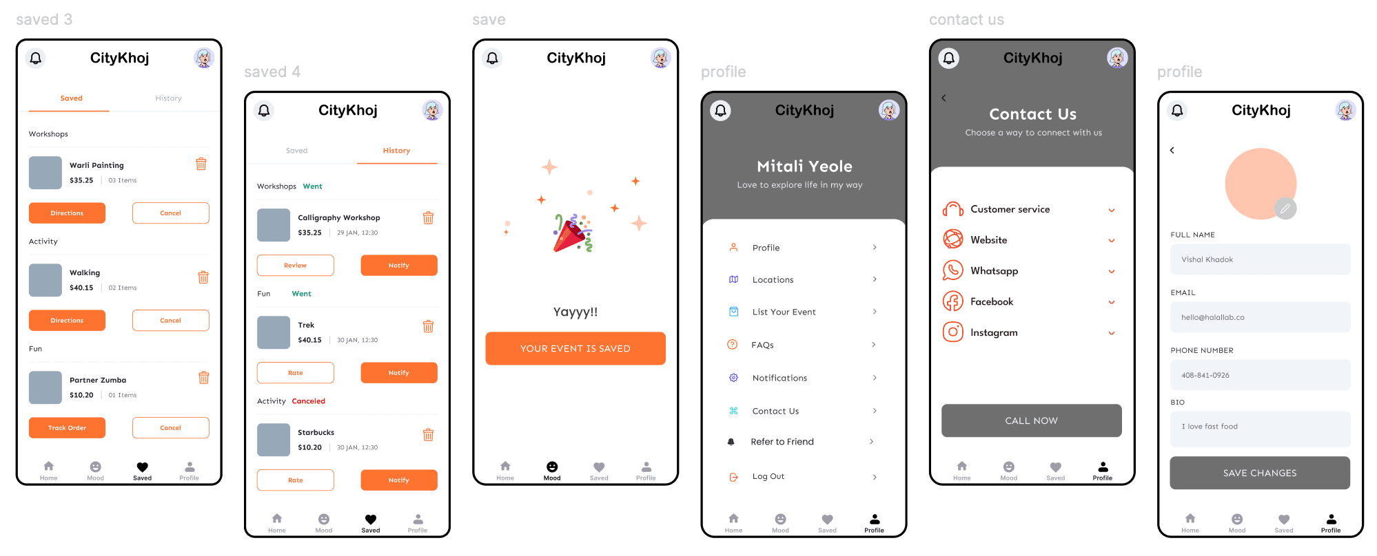
Test, listen, improve.
Can users discover places easily?
Are trails and maps easy to navigate?
Is place information clear and useful?
Change: Simplify map navigation and trail directions.
Change: Add clearer place details, cultural stories and nearby recommendations.
Design changes after testing.
Darker screens and less supporting detail made some information.
Use softer backgrounds, clearer cards and more context.


Turn the structure into screens.


